
Photo Credit: BMW
Most of the car logos feature various things. Take a look at the Porsche logo, which features a black horse from the coat of arms of Stuttgart; the Alfa Romeo logo, which features a man eating a snake from the coat of arms of Milan; the Cadillac logo, which shows the invented family crest of French explorer and fake noble Antoine de la Mothe Cadillac, who founded the city of Detroit; and the Kia logo. Really, the Kia logo is just the Kia logo.
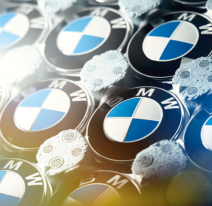
Well, taking inspiration from regional iconography is not unusual in car branding. The BMW logo is one of the simple yet best car logos and certainly one of the most recognized worldwide. However, it’s one that’s fairly unusual and abstract when you think about it. Many wonder what it means and what it really represents other than the brand. People have all sorts of theories, but many remain surprised when they learn the true inspiration.
The Sun newspaper hereby states that the logo represents a spinning propeller, a supposed hangover from the company’s predecessor, which built aircraft engines for the Luftwaffe. However, it is wrong. It is much simpler than that, and the clue is in the company’s name: Bayerische Motoren Werke, or Bavarian Motor Works.
The logo design was inspired by the flag and crest of the car maker’s native Bavaria, located in the southeast of Germany. At the time of BMW’s creation, there was a movement for Bavarian independence from Germany, so it makes sense that it would adopt the state colors.
To clear the air, the Sun newspaper got its propeller idea from basically BMW’s own advertisement in the first half of the 20th century. It also happens that the origin of how it became Bayerische Motoren Werke GmbH was in 1917; before then, it was called Rapp Motor, which used to make aircraft motors.
In the late 1920s, BMW came up with a clever advertisement where the brand logo was placed over the spinning propellers of aircraft to promote the association. It revived the idea in the 1940s. If the campaign intended to create a powerful association in people’s minds, it certainly did, because since then people have had the tendency to believe that the logo shows a propeller up to the present day.
The logo still stands out among others, as does how the BMW carmaker tends to design the cars. BMW remains iconic with the blue and white logo, not to forget the M logo. Yeah, the distinctive BMW M logo with three stripes attached to the M is recognized by petrol heads world-wide.Despite who you are, whether a Nurburgring fan or motorsports enthusiast, anyone who sees the three BMW M colors knows that it’s all about high performance.
The familiar M with the three stripes first appeared on the BMW M1, presented in 1978, which featured both BMW and the M logo. And it was the first car developed entirely in-house by BMW M GmbH. And the striking stripe design that we see even in need of speed first premiered in 1973, long before the finished logo, on the famous BMW 3.0 CSL.
Why the colors red, purple, and blue? Well, a worker at the BMW group says that the blue stands for BMW, the red was probably inspired by the Texaco company, and violet was chosen pragmatically as a mixed color of blue and red. Another says that blue stands for the BMW brand, red for motorsport, and purple for this unique collection.
Ig @ mannu mwendwa